|
Well, I'm a lad of strong opinions. Here are some that are relevant to this page: (1) The term optical illusion is bad because such illusions depend on features of visual perception within the eye-brain system. They do not depend on effects or features of optics. Thus the term “visual illusion” is much closer to being descriptive. (2) I utterly detest, in general, those cartoons and drawings which show something that, when turned upside down, can be interpreted as a totally different image. These used to be found almost exclusively in puzzle books and they are indeed much closer to puzzles than to illusions. In the 19th Century there were whole books devoted to images of this type, and they were often quite clever. What I dislike about the more modern and overly-familar examples is that the drawing in either orientation is almost always unconvincing. Whilst we're on the topic, (3) I even more detest those drawings that are supposed to show two contradictory images in the same sketch, the most common and most annoyingly poor example being the “young girl” who is also simultaneously an “old hag.”. Nope.
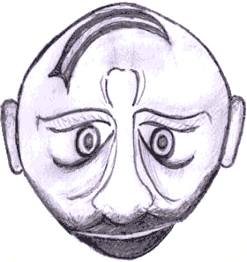
But look back at the pencil sketch above. I don't know who did it, but I find it successful. In the original orientation it's an acceptable cartoon of a middle-aged man, whilst if you invert it,
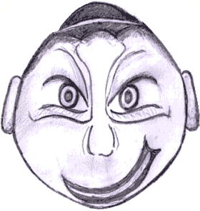
you see the young punk who is presumably responsible for the somewhat dismayed expression of the middle-aged man.
Now for something different, the label for a CD released by a band named Soulwax. Your challenge is to read the title of the CD. Different strategies work for different people. You can try squinting, for instance, or moving your head back and forth, or etc. What works best for me is just tilting my head at an angle of about 45 degrees. You may find the text pops into view, for example as you scroll the image down, and then vanishes again.